How to use our Logo in a proper way and download files in different formats
Guidelines for using our Logo
This page explains how to use our Logo in a correct way and provides downloads in different formats
Icon and explanation
#1959FF
C:90 M:65 Y:0 K:0
#33CC0D
C:80 M:20 Y:95 K:0#CCFFBF
C:20 M:0 Y:25 K:0
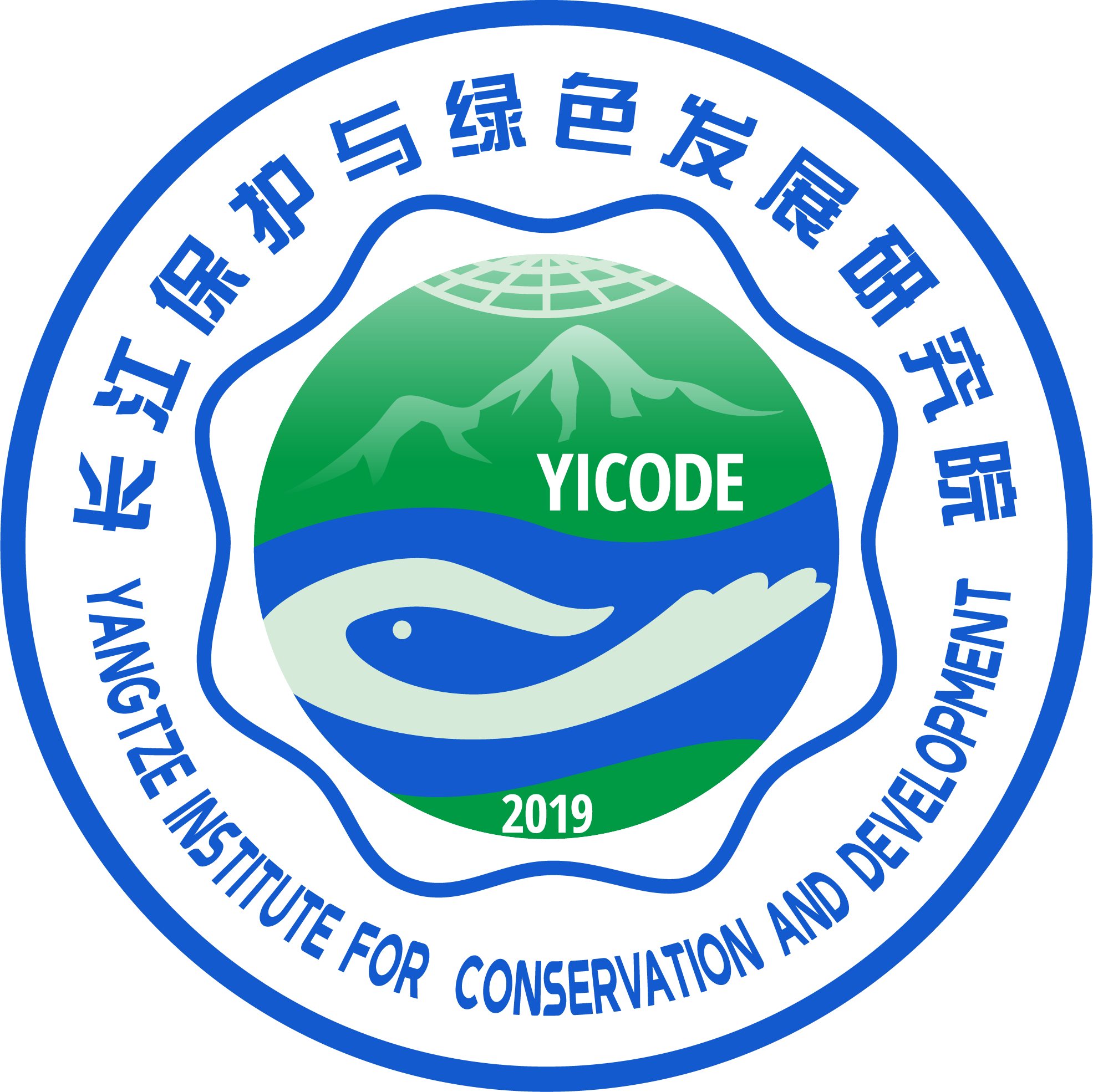
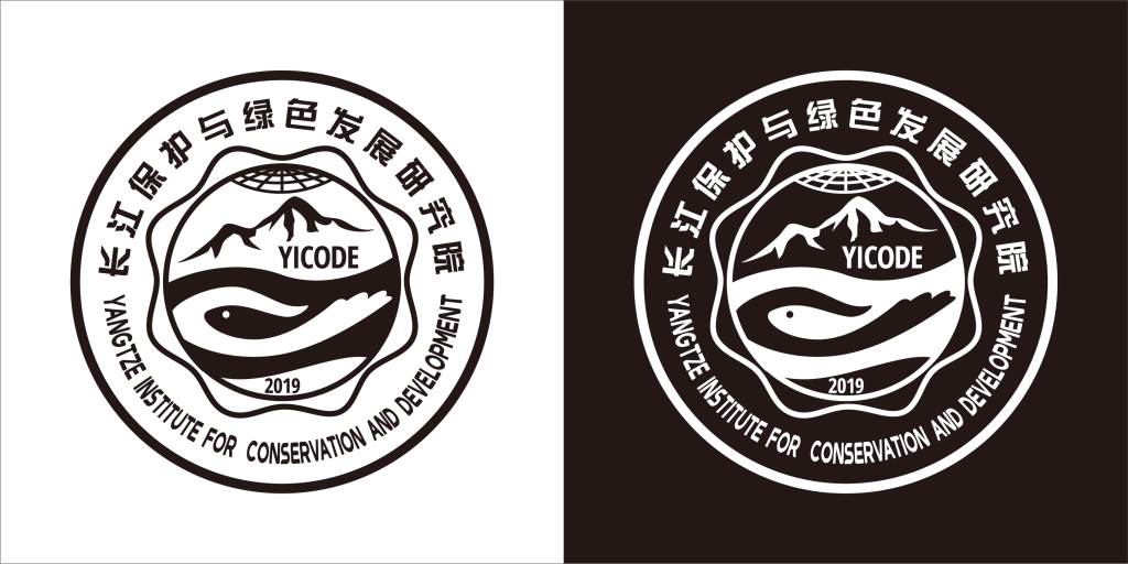
- The icon includes our name in Chinese and English in the outer circle.
- The second circle is the shape of a plum blossom, which is the city flower of Nanjing, where we are located. It is also the same shape from the Logo of Hohai University, which is one of the partners which initiated us.
- The part in the middle is the combination of “the community of shared life between mountain, water, forest, land and lakes”. The lower part standards for water and green land. The element embedded in the blue river could be either a hand or a fish, which stands for our ambition for the protection of water resources and biodiversity. The upper part includes mountain in a distance. It is one of the parties sharing the livelihood of nature and also the peak of knowledge we are pursuing in the field of water science. The upper most longitudinal and latitudinal lines set up our goal of becoming a world class organisation with a focus on the Yangtze.
- YICODE is the abbreviation of our English name.
- Y and I comes from Yangtze Institute.
- CODE comes from COnservation and DEvelopment. We hope our work could contribute to the code of conduct in managing world’s rivers.
Singe color icon
In some circumstances where using colours is difficult or less appropriate, for example, for faxing, photo-copying or single colour printing, our single colour icon would be of use.
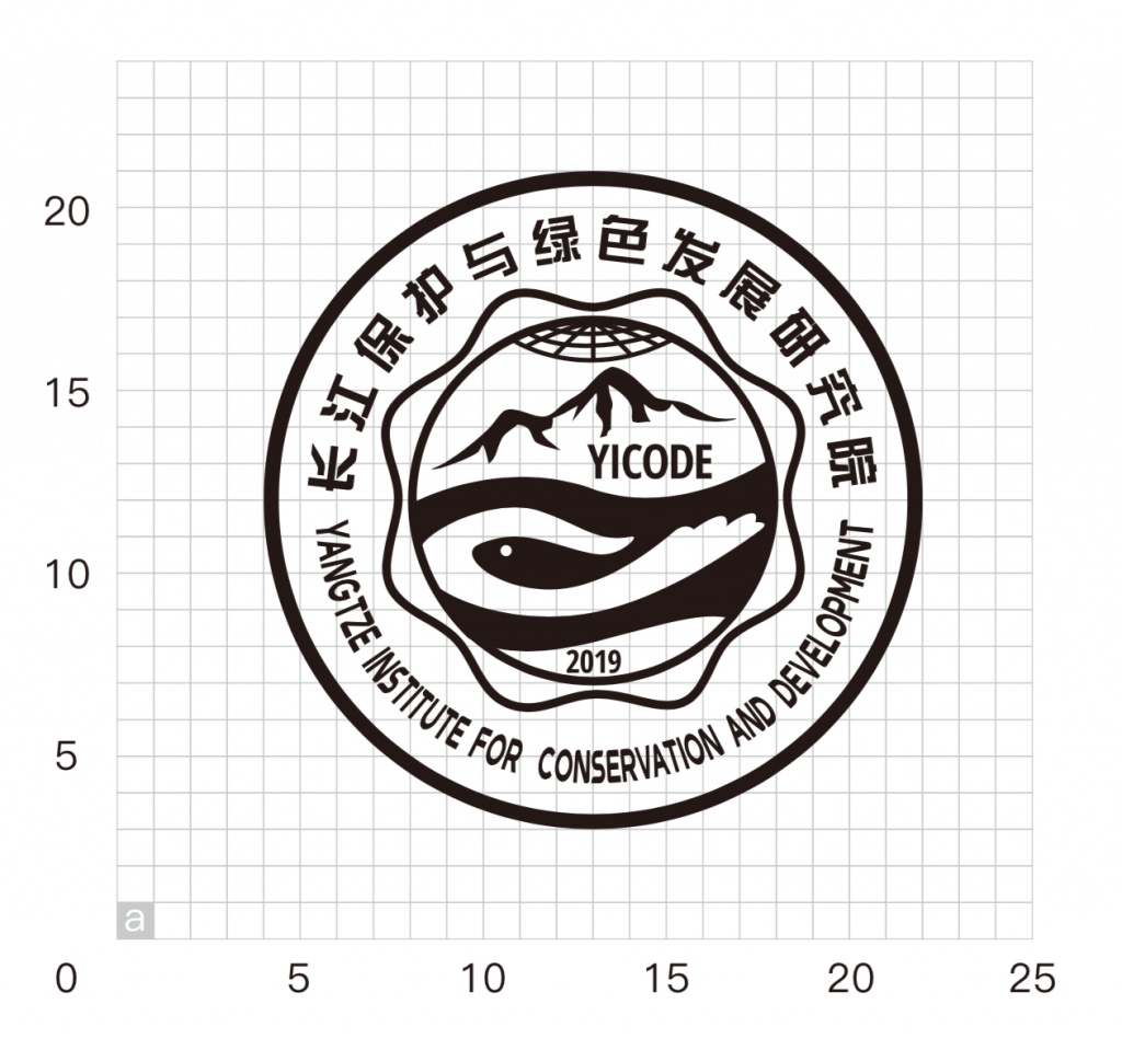
Standard layout of icon
The layout of the icon are illustrated in the picture below (in grids with a resolution of a). The sizing of our icon should be based on scaling up or down the grids.
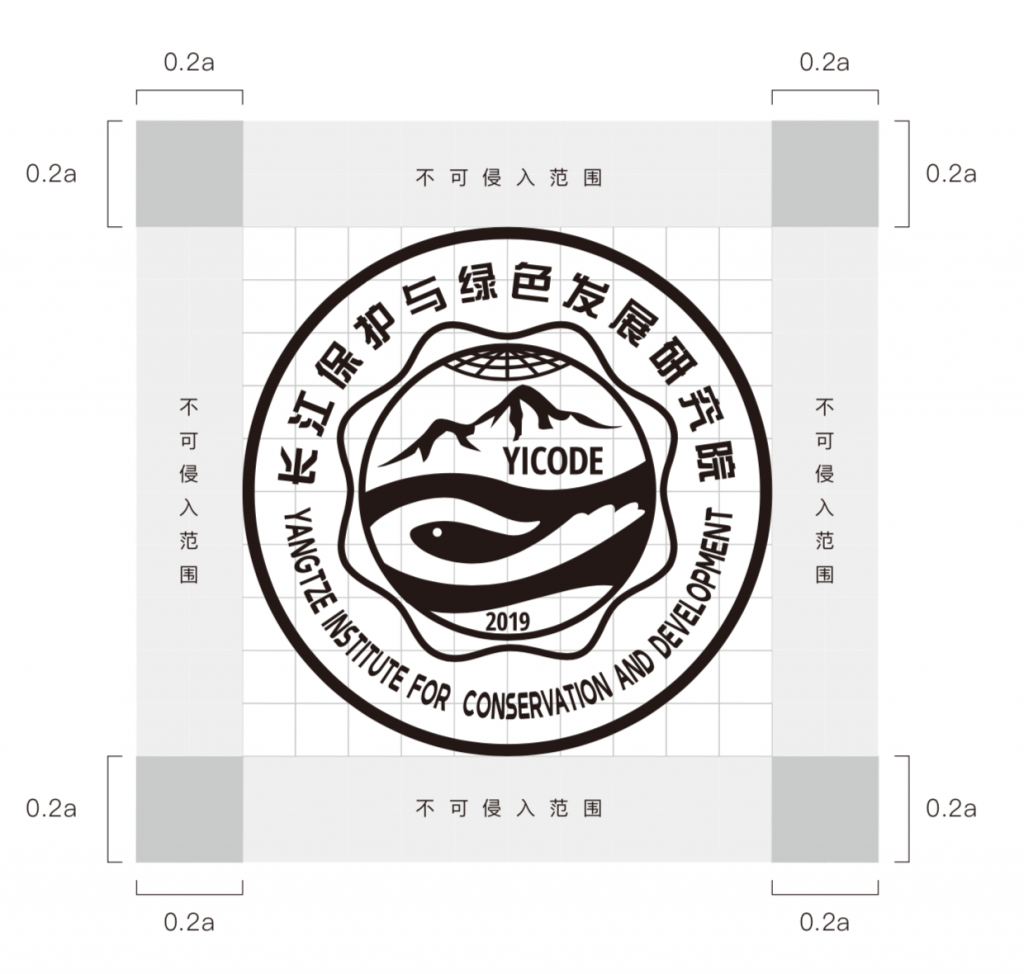
Margin
While using our icon, it should be placed in a space with sufficient margin, so as to avoid interference from other elements. As illustrated below, if we are using the icon at a width and height of a, the margin on the upper, lower, left and right should be no less than 0.2a.
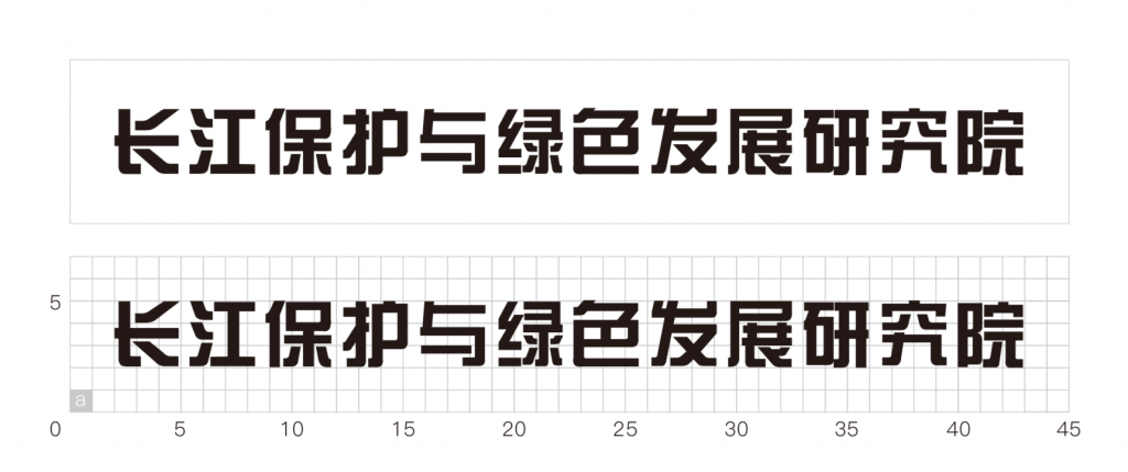
Standard Chinese characters
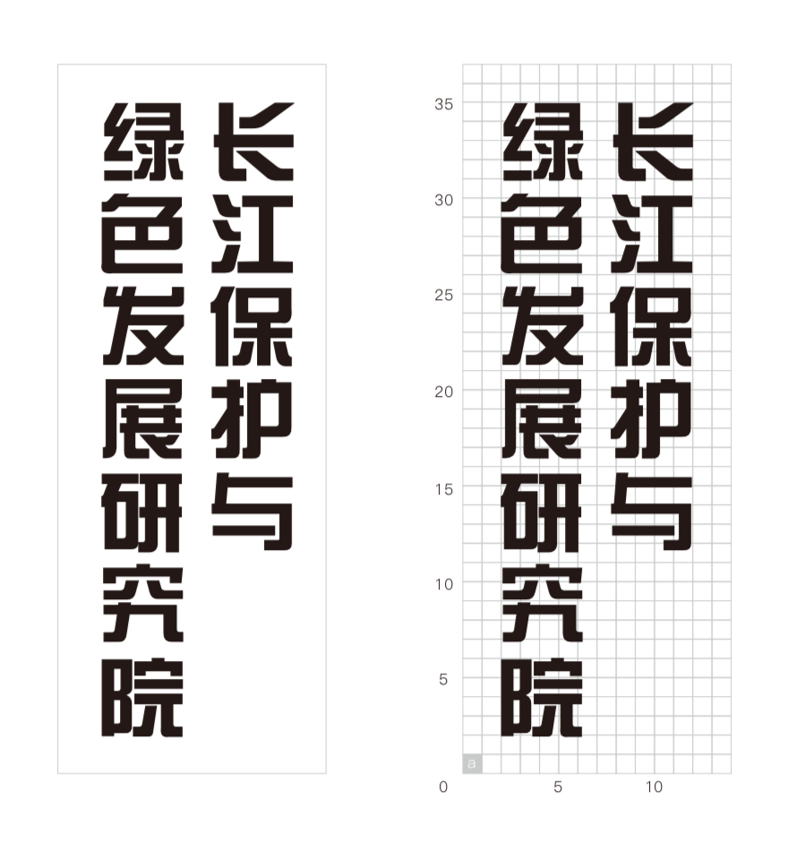
The size, position and margin between characters of our Chinese name (on grids of a resolution of a) are illustrated below. The minimum margin on four sides of the text should be 2a.

Standard Chinese characters (vertical)
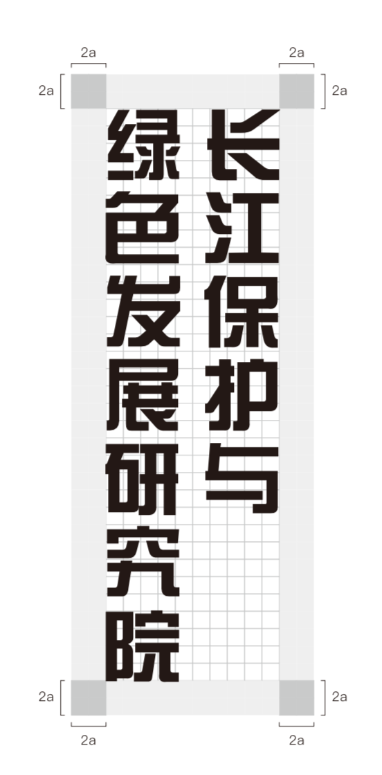
While some circumstances require a vertical layout, The size, position and margin between characters of our Chinese name (on grids of a resolution of a) are illustrated below. The minimum margin on four sides of the text should be 2a.
Standard English characters
The size, position and margin between characters of our English name (on grids of a resolution of a) are illustrated below. The minimum margin on four sides of the text should be 2a.


Standard English characters (vertical)
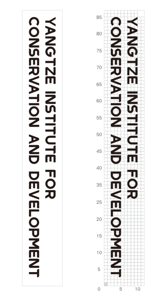
While some circumstances require a vertical layout, The size, position and margin between characters of our English name (on grids of a resolution of a) are illustrated below. The minimum margin on four sides of the text should be 2a.

Combination of elements (horizontal)
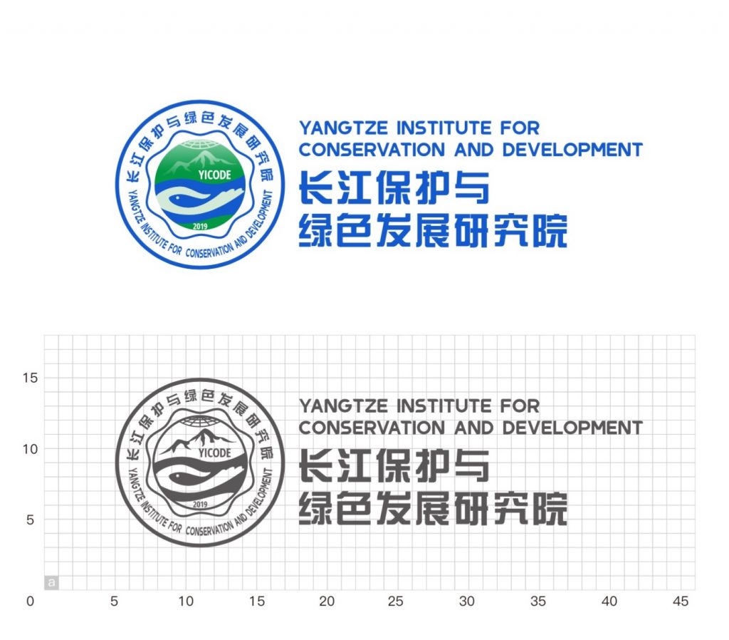
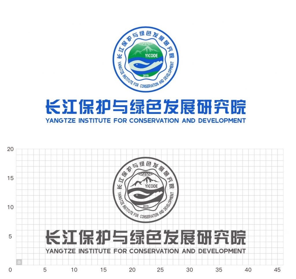
In circumstances where the space for displaying our logo is limited, this scheme would be the preferred one. The size, layout, margins of elements are illustrated below (on grids with a resolution of a).
Combination of elements (vertical)
In circumstances where the space for displaying our logo is not limited, this scheme would be the preferred one. The size, layout, margins of elements are illustrated below (on grids with a resolution of a).
Research fields
A set of icons are used to represent our research fields under some occasions.
Downloads
The follow are vector icon sets in blue (#125ACE), white (#ffffff), black (#000000) and cyan (#006064) colors.
